The Transit Light Curve
In this section, we will show a light curve from the Kepler mission and determine planet parameters. Launched in 2009, Kepler searched for transiting exoplanets for nearly a decade, before the end of its mission in 2018. When it was operating, it was the most powerful planet-hunting observatory ever built. The best part is that all of the data ever collected by Kepler are freely available to the public and can be downloaded from the internet by anyone.
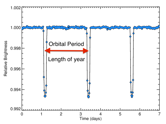
The figure below shows a Kepler light curve of an exoplanet called HAT-P-7 b. This planet is a hot Jupiter - one of the easiest types of planets to detect.
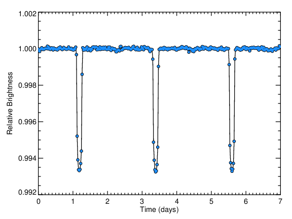
First of all, notice the scale of the plot above. The entire span of the graph is within 1% of the total brightness of the star! Searching for transiting planets requires highly precise brightness measurements.
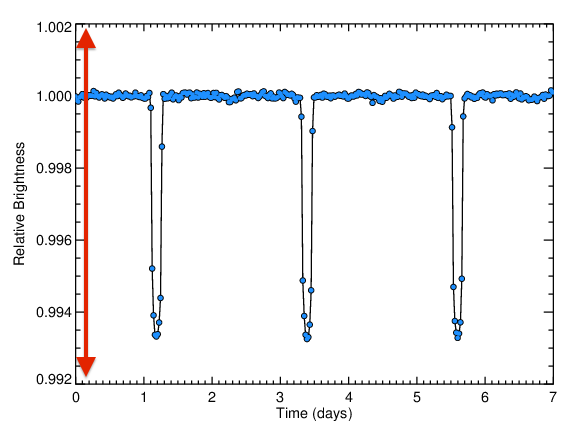
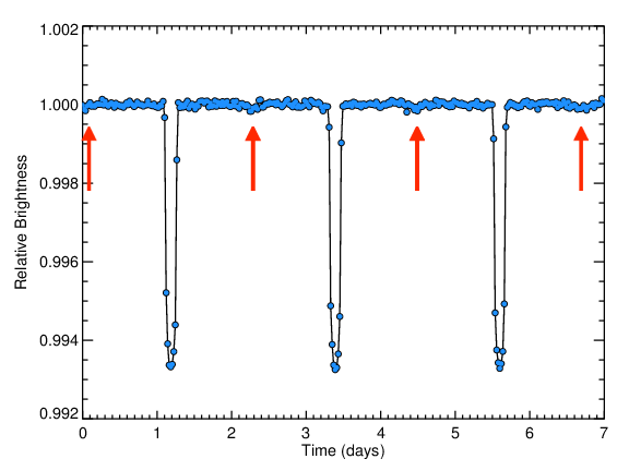
The Kepler light curve of HAT-P-7 shows three very convincing transits - the large dips highlighted with red arrows below.
The depth of these transits encodes the size of the planet.
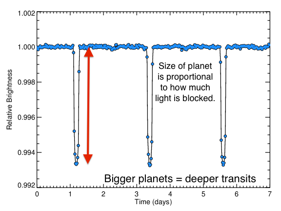
Here, the transits decrease the flux from 1.0 to about 0.994 - a decrease of about 0.6%. Using the formula for the planetary radius:
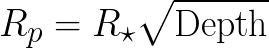
and plugging in values for depth = 0.6% = 0.006, R* = 2 solar radii, we find a planetary radius Rp of about 1.5 Jupiter radii.
The amount of time between two successive transits is the "orbital period" of the planet, which is the length of that planet's year:
When the planet goes behind the star, any light from the planet, either starlight reflected off the planet's surface, or light being emitted by the planet because it is glowing hot, is blocked. This decrease in brightness is called the "secondary eclipse", and for planets is usually quite small.
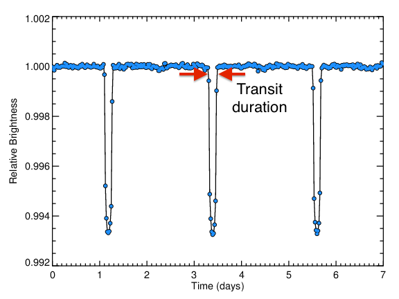
The duration of the transit is the time it takes for the planet to cross over the face of the star. This measurement encodes many observables, including the "impact parameter", or how close to the center of the star the planet transits, the size of the star (or more precisely, how dense the star is), and the eccentricity of the planet's orbit, or how close to a circle the planet's orbit is. It is more difficult to disentangle these different measurements, but with sophisticated analyses, it is possible.
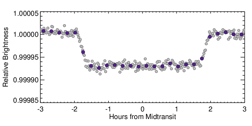
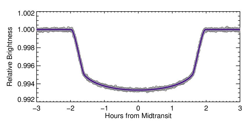
The figure below gives a closer look at the transit light curve. Here, the grey points are again averaged data, this time averages over 20 second intervals, using data from about 6% of the full dataset.
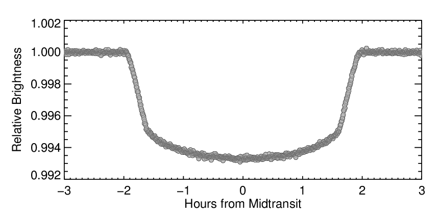
Image: NASA
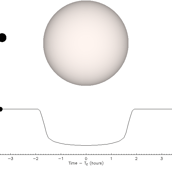
The rounded profile comes from the planet moving across parts of the star with different brightness - when the planet is near the edge of the star, it blocks part of the star that is less bright, so it blocks less total light. This is illustrated in the following animation:
Animation: Jason Eastman
Another interesting feature is that the decrease in brightness into transit is not instantaneous - it takes some time for the planet to pass fully over the edge of the star. This is also illustrated in the animation above.
Astronomers usually distinguish between two different transit durations: the "total duration" tt, from the beginning of the decrease in brightness to the end of the rise, and the "full duration", tf, the amount of time the planet is fully over the surface of the star. The figure below annotates these two different duration measurements.
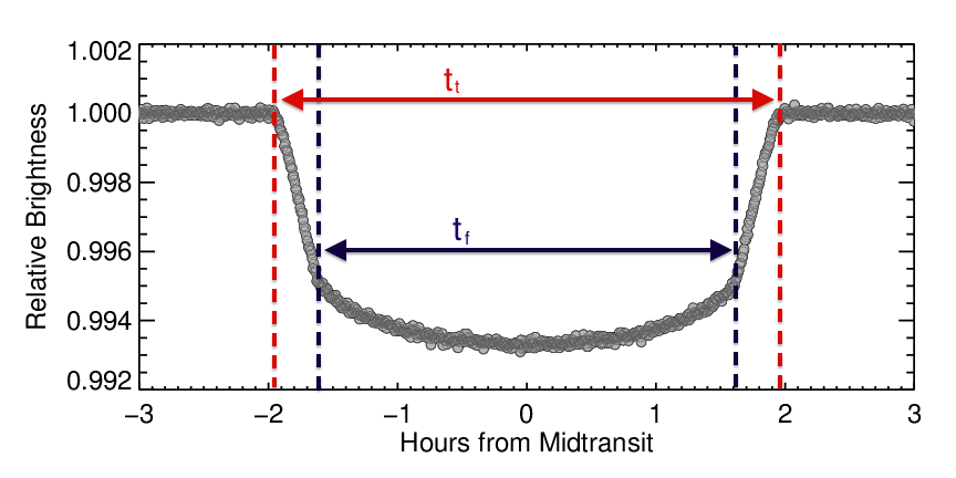
The ratio between tt and tf, when combined with other information like the depth of the transit, gives information about how far from the center of the star the planet transits. Usually, astronomers extract this information by calculating what the transit should look like and comparing that to the observations. This approach, called modeling, results in calculations that very closely match the observed data. A model light curve is shown in purple in the figure below, on top of the data of HAT-P-7 b.
Continue onto Page 3 .